 Austria
 Belgium
 Czech Republic
 Denmark
 Finland
 France
 Germany
 Greece
 Ireland
 Italy
 Latvia
 Luxembourg
 Netherlands
 Norway
 Poland
 Portugal
 Slovakia
 Slovenia
 Spain
 Sweden
 United Kingdom

How to paint your home and decorate your walls with posters
Choosing the right colours for our walls is a particularly delicate task, given how strongly wall colour shapes the overall atmosphere of a room. There are a few principles worth keeping in mind before you begin, so that you can choose the right colour for you with confidence.

Choosing wall colours is one of the hardest parts of furnishing or renovating a home or a shop. At first, it all seems very easy: we have a colour in mind that we particularly love, one we often wear or have seen in someone else’s home, we imagine how it would look in our own space and we head confidently to the shop to buy the paint. That is when we realise things are more complicated than expected: which shade should we choose? Light or dark? Bright or pastel? Pure or mixed with another colour? On top of that, a doubt usually creeps in at this point: will this colour, which looks so lovely on this little swatch, still look good spread across an entire wall?
To answer these questions, we have put together a guide to using wall colours, in which we explain the basic principles to follow when choosing colours to decorate your home, office or shop.
We will also give you suggestions for specific pictures and prints that you can use to decorate walls of different colours. In our gallery, you can buy the posters online that we present in this article.


1. The basic principles of using colour
The entire colour spectrum can be built from what are known as the three “primary” colours: red, yellow and blue. Mixing these three colours gives us the “secondary” colours: green (blue and yellow), orange (red and yellow) and purple (red and blue). Each primary colour and the secondary colour made by mixing the other two are called “complementary” colours: red and green, yellow and purple, blue and orange.



Complementary colours are often used together because, side by side, they enliven each other. This happens because of the phenomenon of “compensation”: when we stare intensely at a colour, our eye sees its complementary colour appear around it. This is why two warm colours placed next to each other cool down and two cool colours warm up, while two complementary colours bring each other out. For the same reason, very colourful surfaces need a good amount of white to ease the transition between the different colours and so balance the colour scheme.
Using two complementary colours creates an explosion of colour, which should be handled with care, perhaps softening the transition between the two with white or grey, or by keeping them physically apart. To maintain a certain colour harmony, it is always best for one of the two colours to be light and pale (ideally the dominant one), while the other is brighter and more vivid (the secondary one, used in a smaller proportion).


2. Colours for the home: how to choose the right ones for you
Our personal preference for certain colours comes from the associations each of us makes between a specific colour and past memories or emotions. That is why choosing a colour for the walls of our home is highly subjective and depends on the mood we want to create inside it.
As a general rule, remember that almost anything goes in a bright room, while in a dark room the choice is limited to light, warm and luminous colours.


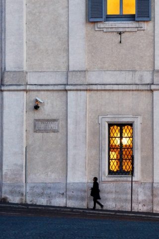
The very first decision, before anything else, is to decide how many colours to use to decorate the walls. To make this choice, you can draw on four different colour approaches:
- Tone on tone: choose a single main colour and decorate the rooms using its various shades, perhaps adding neutral colours such as white or grey.
- Separate hues: choose three colours that are far apart from one another, one warm and two cool, or vice versa.
- Complementary colours: use only two complementary colours, perhaps adding neutrals such as white or grey.
- Polychromy: choose two or three colours that sit very close together on the spectrum and decorate using shades of those colours.
Two principles apply to all of these approaches: in general, no more than three colours should be used, and one should be dominant, covering more than half of the space, while the second is used more sparingly and the third only for a few scattered splashes of colour within the composition.


3. Which colours to use for your walls at home
The perfect colour for our home is undoubtedly a personal choice, depending on the atmosphere we want to breathe in our rooms, the style we want to follow and the rest of the furnishings with which we need to create an elegant harmony.
According to today’s trends, pastel colours are certainly considered more elegant and refined. Bright colours, on the other hand, are often used in small doses to bring vitality and energy to a room, and are rarely used as the dominant colour.
Here are some prints in pastel shades and others in brighter tones, to suit different needs.




When choosing the colour with which to decorate your walls, keep these general principles in mind:
- Cool colours make things seem further away, give a room a sense of space and create calm and quiet.
- Warm colours bring things closer and make spaces feel smaller, while creating brightness, warmth, cheerfulness and activity.
- Bright, vivid colours draw attention to an important detail (for example, a particularly fine piece of furniture such as a sofa or a picture), while neutral colours can hide objects we would rather not be noticed.
- We can shorten an overly long room by painting the end wall in a dark colour, which makes it seem closer, and we can do the same with a ceiling that is too high; likewise, light walls and ceilings recede and increase the sense of depth.
Turning now to the different lighting conditions our rooms may have, bear in mind that some colours are better suited than others depending on which direction the room faces:
- North: in a north-facing home, which gets little direct light, avoid any dark colour and concentrate on light, warm and very luminous colours to make up for the lack of light.

- East: an east-facing room is flooded with the intense colours of the rising morning sun, which are best tempered with light, soft colours.

- West: the sunset will warm up the colours of the room considerably, so use neutral or cool-leaning colours so as not to amplify this effect further.


- South: south-facing rooms are flooded with direct sunlight, so it is best to favour fresh tints and cool colours that will shine in the daylight.

4. Colouring your walls with specific shades
Now for more specific advice on the various colours we can use in our home or shop, depending on our needs.
- Decorating your walls in red creates an energetic, passionate mood. Red is the colour of fire and blood, of love and war, and it is an excellent way to liven up a room. Given its bold character, it should be used with great care.

- Another way to energise a room is to paint the walls yellow, a warm colour associated with the sun, summer and light. It is a dominant, active colour that brings joy, warmth and a sense of welcome, which makes it particularly suitable for children’s rooms.


- At the opposite extreme, we can choose to decorate your home in light and dark blue. Unlike the other two primaries, it is a cool colour that evokes stillness, calm and dreams, and it is ideal for decorating the bedroom.


- Decorating your walls in green, on the other hand, is an excellent way to create a sense of serenity and reconnect with nature. Green sits halfway between a warm colour (yellow) and a cool one (blue), which is why it brings balance, introspection and rest.

- Coming back to warm colours, another option is to paint the walls orange. It is a warm colour that combines the energy of red with the expansiveness of yellow. It warms and spurs us into action, while striking a balance between light and passion.


- A very common choice in English-speaking countries, though less widespread in Italy, is to decorate the walls in purple. It is a very distinctive colour, elegant and versatile: deep and vibrant, it suits modern interiors perfectly, while in a pale, lilac shade it is ideal for Provençal-style decor.


- At the other end of the scale, decorating the home in white is a very popular choice, thanks to this colour’s particular elegance, its brightness, the sense of order and cleanliness it conveys and its personality, which is strong yet understated.
- For a modern, on-trend look, we can paint the walls pink, a warm colour like red but softer and more feminine, energetic and passionate without the aggressive edge of other warm colours.


Did you find this article useful? Then share it on our social media pages! Remember that in our gallery you will find modern prints and canvas pictures of all the images we have shown you in this article.
If you need specific advice, write to us and we will answer your questions!