 Austria
 Belgium
 Czech Republic
 Denmark
 Finland
 France
 Germany
 Greece
 Ireland
 Italy
 Latvia
 Luxembourg
 Netherlands
 Norway
 Poland
 Portugal
 Slovakia
 Slovenia
 Spain
 Sweden
 United Kingdom

How to choose the right posters for yellow walls
Yellow is a warm, open and sunny colour, ideal for creating a welcoming and stimulating space. Although it lacks the aggressive edge of red, it is a colour that spurs activity, so it should be used with some care, favouring warm and pastel shades for large surfaces.

If everyone describes you as sunny, cheerful and open, yellow and its variations are perfect colours for the interior walls of your home. When we furnish a new home or refresh the colours of one that feels anonymous, we need to be very careful, because colours have a huge effect on the mood and emotions we will feel in our rooms.
In this guide we will give you some advice on how to decorate the walls of your home in yellow. In our gallery you will find pictures online for sale featuring all the images in this article, which you can use in your home or shop.


1. How to decorate interior walls in shades of yellow
Yellow is a primary colour, along with red and blue. It is a warm colour, associated with the sun, light and feelings of joy, cheerfulness and openness. Unlike red, it lacks the element that suggests violence and passion and, as it moves towards white, it becomes synonymous with purity and cleanliness.
You can decorate your walls with posters and prints whose colour scheme echoes this shade to bring light and energy to your home or shop. For these reasons, it is particularly suited to anyone who wants to create a sense of space and an open, welcoming atmosphere.
Posters and photographic prints can help you add a touch of yellow to your rooms without having to buy new furniture or repaint the walls. To get an idea, take a look at these suggestions from our gallery!


To decorate your walls with a bright colour like yellow, we recommend using light, pastel shades for large surfaces, so as to create a very elegant, refined effect without overloading the room with colour.

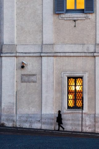
For an understated style, you can also use posters and prints that combine yellow with other colours, like the ones shown below.


2. Posters and pictures for yellow walls
When decorating the walls of a home or shop with yellow as the dominant colour, it is worth following a few principles to create harmonious colour schemes.
2.1 Use the “tone on tone” effect
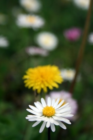
A very elegant way to use colour in a room is the so-called “tone on tone” effect, which involves mainly using variations of a single colour.
In our case, this means using posters and photographic prints with yellow elements that match the wall. Here are a few suggestions from our gallery of flower and plant posters.


2.2 Brighten the room with complementary colours
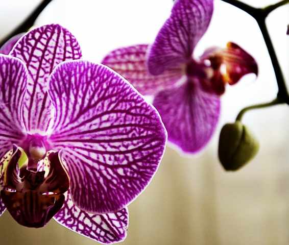
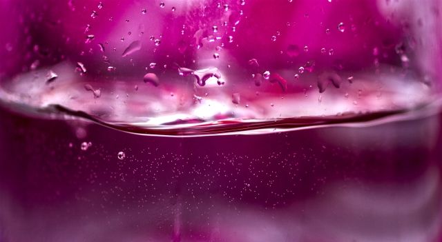
The complementary colour of yellow is purple, the secondary colour made by mixing the other two primaries, red and blue. Thanks to the phenomenon of “compensation”, whereby our eye sees a colour’s complementary appear around it when we stare at it, we can use purple to add a strong note of vitality to our rooms, creating a very bold contrast with yellow.
It is worth stressing that these contrasts must always be handled with great care, so as not to create an unpleasant or uncomfortable feeling. Posters and pictures are an excellent way to use complementary colours in limited areas without having to make major changes to your decor. Below we suggest some purple prints you can use for this purpose.


2.3 Tone down the colour with black and white
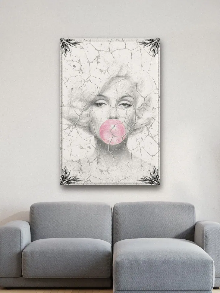
If the room you are working on is particularly colourful, because of a wall painted in a strong yellow or other furnishings chosen for a tone-on-tone effect, you can lighten the whole composition with black and white prints. Take a look at these suggestions.


If you found this article useful, share it on your social networks. Remember that in our gallery you will find modern prints of all the images that accompany this article.