 Austria
 Belgium
 Czech Republic
 Denmark
 Finland
 France
 Germany
 Greece
 Ireland
 Italy
 Latvia
 Luxembourg
 Netherlands
 Norway
 Poland
 Portugal
 Slovakia
 Slovenia
 Spain
 Sweden
 United Kingdom

How to decorate your walls with red and choose the right pictures
Red is the colour of passion, energy and vitality. Its particularly strong character makes it ideal for warming up and shaking up rooms in need of a refresh or a strong touch of personality, although it should be used with great care and restraint.

Sometimes we find ourselves feeling particularly dissatisfied with the decor of our home or shop: whether out of a natural wish to refresh our spaces from time to time or because we have neglected the need to give them personality for too long, at some point this urge for change can no longer be put off. It is time to tackle the decor!
Many people underestimate the effect that the furnishings and colours of their home or shop have on the emotions they feel when they are inside. Rooms that are too dull or anonymous feel boring, while rooms that are too bright or colourful can make us feel restless and uneasy. It is therefore important to choose the right colours for our home and shop carefully, based on the feelings we want them to evoke.
In this guide we will focus on how to liven up the colours of our walls with red. We will also suggest some images from our gallery, available as modern prints and pictures, to brighten up your rooms with red.

1. Wall colours: how to use red
Red is one of the three primary colours, along with yellow and blue. It is a warm colour that is particularly strong and bold. It evokes energy, fire and passion, but also blood and violence. These qualities make it particularly suitable for shaking up rooms that feel stale or lack a strong personality.


On the other hand, it is important to remember that, because of its more aggressive side, it can easily irritate, make us restless or leave us feeling uncomfortable. For this reason, it should always be used sparingly and with care in our homes.
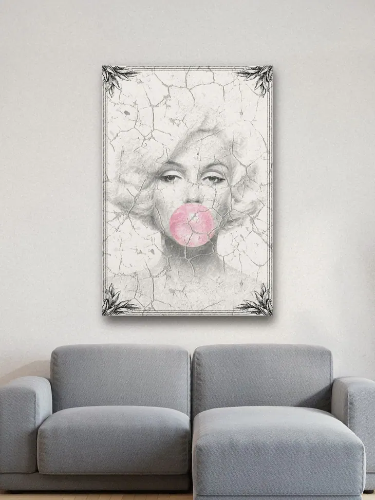
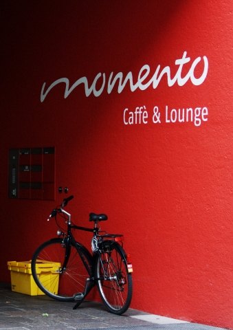
To use it without risking these negative effects, we can choose photographic prints in which red makes up only a small part of the overall image, which also creates a particularly elegant effect.


2. How to decorate with red
Being a warm colour by nature, red can be used to warm up a room whose atmosphere feels too cold and impersonal. Always avoiding it as the dominant colour and using it instead as a secondary colour or simply for splashes of colour, we can introduce a few red accessories such as lamps, coat stands or textiles (or darker or lighter variations of red, depending on the style of the home, the lighting and our personal taste). Small touches within our decor, like little fires lit here and there, are enough to create the sense of warmth we are looking for.


Red is also particularly well suited to adding a touch of femininity, intrigue and passion, thanks to its sensual connotations. With this in mind, we can use it, for example, to add a particularly elegant note to a modern-style living room, with a sofa or an art print that picks up this shade. It is a colour that has always been associated with elegance and luxury, because in ancient times the process used to produce it was particularly expensive.
Take a look at these fine art photographic prints that might be just what you need.


Red is also the colour used to signal danger, and our eye picks it out immediately. Making the most of this, we can use it to draw attention to a particularly important feature of the home, such as a fine piece of furniture, or to mark an area we would rather people kept away from.


3. Decorating walls with red
When decorating red walls with posters and pictures, our advice is to use them to tone down the strong colour that is already there. Painting a wall red, or in one of its lighter or darker variations, is certainly a great way to give your home or shop a strong personality, but it is best to balance the colour scheme so as not to create a negative feeling.
Our advice is therefore to reduce the intensity of the colour with shelves, bookcases or other furnishings in white or neutral colours that go well with the shade of red you have chosen, or with black and white pictures and prints. Below are some suggestions for prints you can use in your rooms.


In a room that feels a little dull, with walls painted white or a neutral colour, we can use prints with shades of red to quickly liven up the atmosphere. To avoid too sharp a contrast, it is best to choose prints in soft or pastel tones.

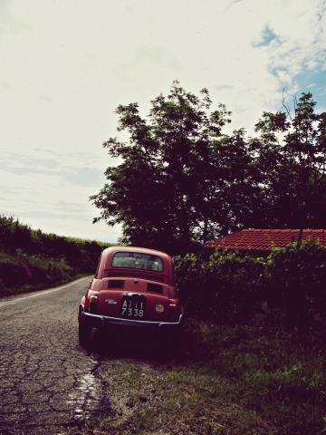


If you found this article useful, share it with your friends through our social media pages. Remember that in our gallery you will find prints and canvas pictures of the images we have shown you in this article.
And if you need specific advice, write to us and we will reply as soon as possible!